Materi Dasar Trading Forex

12. Standard Deviation


A measure of dispersion of a set of data from their mean. The more spread apart the data is, the higher the "deviation". In statistics is can also be calculated as the square root of the variance A.


Volatile price would have a high standard deviation. In mutual funds, the standard deviation tells us how much the return on the fund is "deviating" from the expected normal returns.

3530c9e1ee.png
 
13. STOCHASTIC

Stochastics are an oscillator developed by George Lane and are based on the following observation:

As prices increase - closing prices tend to be closer to the upper end of the price range As prices decrease - closing prices tend to be closer to the lower end of the price range

Fast Stochastics consists of two lines, %K and %D:
- The %K line measures, as a percentage, where the current close is, in relation to the lowest low over the observation period. This is shown on a scale of 0 to 100, where 0 is the observation period low, and 100 is the observation period high.
- The %D line is a Simple Moving Average of the %K. Because it is a moving average, this line is smoother than the %K and provides the signals for an overbought / oversold market.

Fast Stochastics are more sensitive than Slow Stochastics and therefore more likely to give false signals. As a result Fast Stochastics are less commonly used than Slow Stochastics. The most common uses of Stochastics are to:

- Indicate overbought and oversold conditions

An overbought or oversold market is one where the prices have risen or fallen too far and are therefore likely to retrace. If the %D line is above 80% then the close is near the top end of the range of the observation period, while a reading below 20% means that the close is near the bottom end of the range of the observation period. Generally the area above 80 is considered overbought, while the area below 20 is oversold. The specified overbought/oversold ranges vary. Other commonly used ranges include
75-25, 70-30 and 85-15. Overbought and oversold signals are most reliable in a non-trending market where prices are making a series of equal highs and lows.

19eeaf62b9.png
 
Fibonacci Retracement

Fibonacci Retracement

Fibonacci Retracement adalah indikator kelas mahir. Anda boleh bilang ini indikator paling absurd karena cuma menggunakan kombinasi angka-angka. Tapi, kami bisa buktikan sebaliknya.


Sejarah Singkat
Fibonacci dinamakan begitu karena penemunya, Leonardo Fibonacci. Mungkin awalnya dia iseng, menjumlahkan angka-angka secara berurutan. Angka berikutnya adalah penjumlahan dua angka sebelumnya, begini jadinya deret Fibonacci itu: 0, 1, 1, 2, 3, 5, 8, 13, 21, 34, 55, 89, dan seterusnya. Pokoknya Anda jumlahkan saja dua angka paling terakhir untuk mendapatkan angka setelahnya. Jadi setelah 89 deret Fibonacci berikutnya adalah… betul, 55 + 89 = 144.

Apa Keistimewaannya?
Jika Anda bagi satu angka di deret tersebut dengan angka sebelumnya, maka akan didapatkan angka 1.618 (silakan coba), dimana reciprocalnya adalah 0.618 (0.618 x 1.618 = 1). Angka tersebut adalah golden ratio dalam seni dan dalam tubuh kita, serta di alam (kelopak bunga, kerang, lingkar pohon). Ini adalah rasio ajaib alam, dan kita di pasar modal seolah-olah meniru alam, maka digunakanlah rasio Fibonacci tersebut.

Ada tiga angka fibonacci yang paling sering digunakan di analisa teknikal, yaitu 0.618, 0.382, dan 0.236. Dua angka terakhir didapatkan dengan mengalikan 0.618 dengan angka sebelumnya. Keistimewaan dari angka-angka ini adalah harga cenderung untuk memantul di angka-angka ini.
 
Bullish Symmetrical Triangles

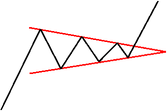
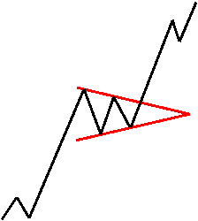
Bullish symmetrical triangles represent neutral periods of doubt and indecision. They are characterized by a series of higher lows and lower highs as the forces of supply and demand are nearly equal.Each rally is seen as a selling opportunity while each dip is met with buying. The pattern is typically large and takes several months or more than a year to form.

stbull_clip_image001.gif


The best breakouts occur ? to ? of the way through the pattern. A stock seems to gain energy as it is compressed into the triangle, but that energy dissipates beyond the ? point. It is recommended that traders abandon a stock that trades beyond the ? mark for very little movement is likely to occur. Volume typically diminishes as the pattern develops because traders become more and more unsure as to the stock's future direction. Then, seemingly without warning, the stock explodes out of the pattern.

Bullish symmetrical triangles appear in uptrends and typically resolve themselves to the upside. Breakouts to the upside must be accompanied by a significant increase in volume to confirm the breakout. Failure to accomplish this doesn't automatically render the play invalid, but it does raise a yellow flag. Besides volume, the astute trader ought to look for a close above the most recent high. This price represents the previous area of selling pressure and an area where stockholders may be looking to “get out even.” It is recommended that if volume does not accompany the break, and if the stock fails to make a higher high within a reasonable amount of time, the trader should move a sell stop up to protect profits.

The expected price movement upon breakout is approximately equal to the widest part of the pattern.

Example :

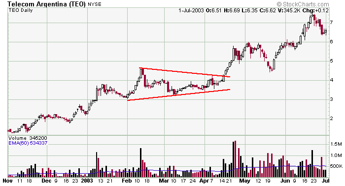
ST%20%28bull%29%20TEO.png

TEO formed a typically symmetrical triangle in an uptrend in the late winter months of '03. After steadily rallying on solid volume (notice the black volume bars are generally bigger than the red ones) the stock made a lower high and a couple higher lows as the stock was compressed by converging trendlines. Volume then surged on the mid-April breakout. Notice the widest part of the pattern (approx. 1.75 points) accurately predicted the move from 4.25 up to 6.0. Textbook play.


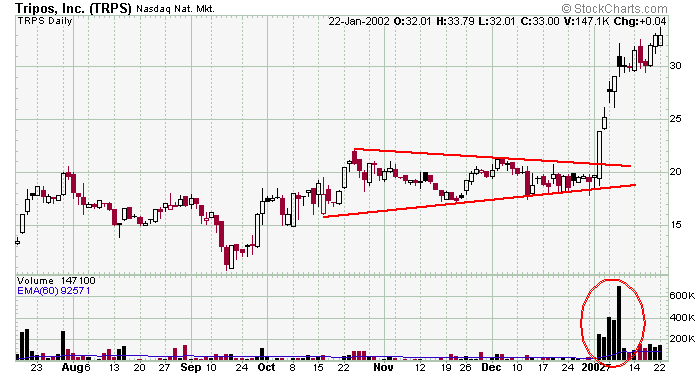
ST%20%28bull%29%20TRPS.png

TRPS traded into a symmetrical triangle and broke out on massive volume. Notice the move from 10 to 20 into the pattern was pretty good at forecasting the move from 20 to 30 upon breakout.


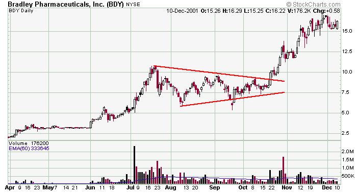
ST%20%28bull%29%20BPRX.png

BDY formed a solid symmetrical triangle pattern in the fall of '01 and provided a great move to the upside when the stock broke out. Notice the volume; it was huge on the rally into the pattern, and than it significantly fell off within the pattern.That's exactly what you want to see. Then volume surged again on the breakout. Textbook scenario.
 
Bullish Ascending Triangles

Ascending triangles form in uptrends and characterized by a series of higher lows but the same highs. They have a definite bullish bias and typically form in 2 to 8 weeks.

atbull_clip_image001.gif


It is as if a massive sell order has been placed at the upper trendline and even though the stock is strong and in an uptrend, it takes some time to fully execute the order. Volume usually diminishes as the pattern develops. Once the overhead supply is absorbed, the stock is free to catapult higher because the lack of supply shifts the supply/demand imbalance to favor the buyers. Also, if indeed a stock is in a steady uptrend, every stockholder who bought in the prior several months will be showing a gain. Satisfied and happy stockholders rarely sell. This reality also helps to push the stock higher after the break.

The best breakouts occur ? to ? on. Breakouts that art art breakouts occur &frac1e delayed until prices crowd into the apex usually fail or are mediocre at best. If by chance a stock trades below the lower trendline, it is not reason to go short. Instead, the trader ought to simply redraw the lower trendline and keep watching for an eventual break to the upside. This act of redrawing a trendline is pretty common. Remember, drawing trendlines is a subjective art at best. They are the trader's best guess as to where support and resistance could be or should be, so redrawing them is perfectly permissible.

Breakouts should be accompanied by a significant increase in volume. Failure to accomplish this doesn't render the breakout invalid, but a red flag is raised and appropriate stops should be employed.

There are two guidelines a trader can use to determine the extent of the rally upon breakout. The first expected price movement is approximately equal to the widest part of the pattern. The second price target is equal to the rally into the pattern. The extent of the advance will often depend on the overall market. A strong market will help greatly in achieving the more ambitious price target, but in a weak market, a trader should be happy with just a moderate advance.

Example :

AT%20ATH.png

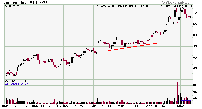
ATH was in a steady uptrend when it consolidated in an ascending triangle pattern. Resistance is not perfectly defined but the series of higher lows maintains the generally upward nature of the stock. Volume didn't exactly surge on the breakout, but the stock didn't pullback much, so there was never a reason to get out (remember, volume is used as a confirmation – not a decision making element). Eventually the bulls stepped up and provided a nice gain for those patient enough to stay with the position.


AT%20MOVI.png

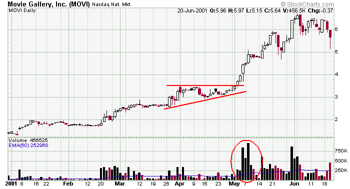
This is a textbook play for MOVI. Volume surge on the move into the pattern and then calmed down within the pattern. Then volume surged again on the breakout. This is exactly the type of action you want to see.


AT%20ALLY.png

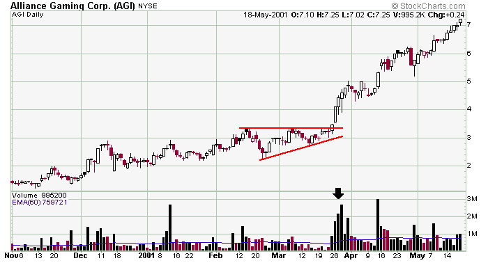
AGI was in a steady uptrend when it traded into and then exploded out of this ascending triangle pattern. Notice how resistance is very easy to determine (always a bonus when it's exact, and you don't have to estimate) and how volume dried up just prior to the breakout.
 
Bullish Rectangles

Bullish rectangles represent large periods of doubt and indecision. They are characterized by parallel trendlines as the forces of supply and demand are nearly equal. The pattern is typically large and forms either horizontally or with a slight downward slant against the overall uptrend.

rectbull_clip_image001_0000.gif


Bullish rectangles appear in uptrends and typically resolve themselves to the upside. Breakouts to the upside must be accompanied by a significant increase in volume to confirm the breakout. Failure to accomplish this doesn't automatically render the play invalid, but it does raise a red flag. Besides volume, the astute trader ought to look for a close above the most recent high. This price represents the previous area of selling pressure and an area where stockholders may be looking to “get out even.” It is recommended that if volume does not accompany the break, and if the stock fails to make a higher high within a reasonable amount of time, the trader should move a sell stop up to protect profits.

If the rectangle is large, the expected price movement is approximately equal to the height of the rectangle. If the pattern is on the smaller size, then the expected price movement should mirror the price movement preceding the pattern.

On a side note, rectangles are difficult to play. Symmetrical triangles have converging trendlines, and therefore must break by a certain day. But since rectangles have parallel trendlines – and therefore theoretically can go on for many months - no time horizon is offered as to when the stock will most likely break.

Example :

Rect%20%28bull%29%20CIG.png

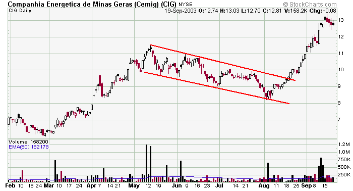
CIG was in a solid uptrend with volume to support the strength when it traded into this bullish downward sloping rectangle pattern. The falling nature of the pattern acts to shake out the weak long positions and cause a little confusion (as evidenced by the lack of volume in June and July. The stock then breaks out and volume surges. It's not an easy trade because the parallel trendlines don't offer any clues as to when the stock will breakout, but following other charting tools (like the high volume bullish engulfing pattern that formed at the bottom of the pattern just before the stock moved up and broke out) will help.


Rect%20%28bull%29%20DPH.png

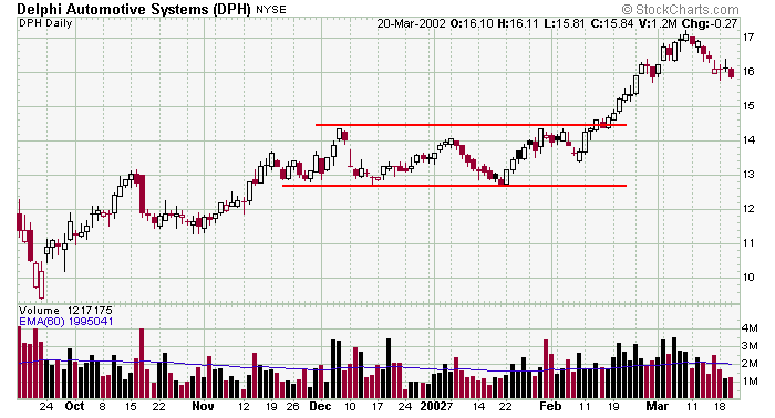
DPH was in steady uptrend when it formed this bullish rectangle pattern. At first the pattern is bullish because the stock is in an uptrend. If the pattern lasts too long (this is subjective) the momentum would be neutralized. Notice the big volume in late February and early March. The first price target is measured by the height of the rectangle. The second target is measured by the move into the pattern.


Rect%20%28bull%29%20ACI2.png

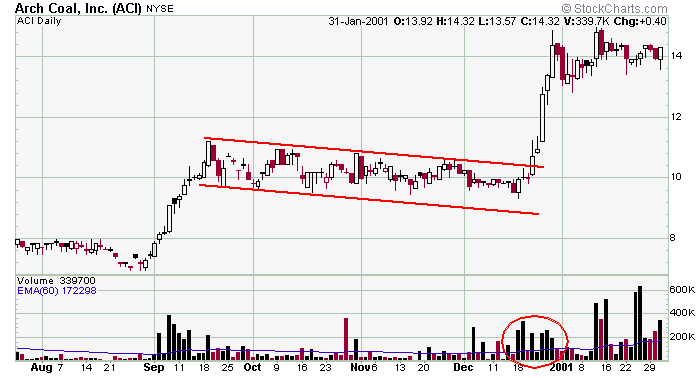
This is a textbook bullish rectangle pattern. The stock rallied on huge volume in early September. Then the stock traded between parallel trendlines on much lighter volume, and then the stock broke out on another big volume surge. The quick and violent move into the pattern was from about 7 to 11, so it is no surprise the move out of the pattern was also quick and violent and from 10 to 14.
 
Bullish Pennants

Pennants are small continuation patterns that represent brief pauses within an already existing trend. They are characterized by converging trendlines and have a definite bullish or bearish bias depending on the overall trend.

pennbull_clip_image001_0001.gif


Bullish pennants typically appear in the middle of large rallies or immediately after a stock has broken out of a basing period.

Bullish breakouts should be accompanied by a significant increase in volume. Use appropriate stops if this is not seen.

The price action prior to the pennant formation can be used as a guide in predicting the price movement upon breakout. So, for a bullish pennant in an uptrend to truly possess great potential, it must have been preceded by a significant move (i.e. if the movement into the pattern was quick and full of energy, the rally after the breakout most likely will be quick and full of energy).

The expected price movement upon breakout is approximately equal to the distance of the move into the pattern.

Example :

Penn%20%28bull%29%20NWS.png

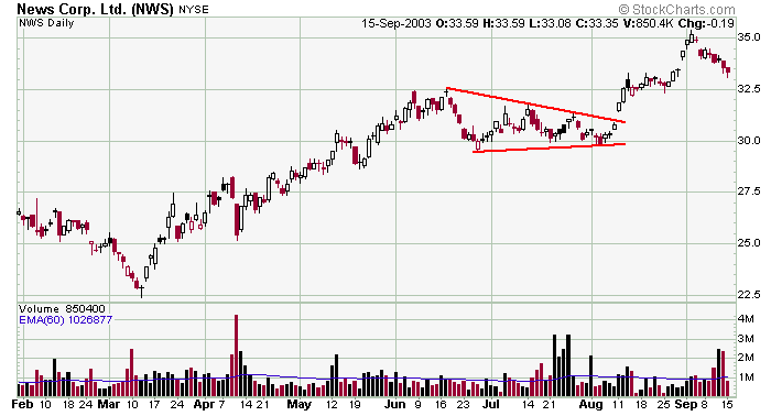
NWS was steadily trending up when it traded into this 7-week bullish pennant pattern. The volume surge within the pattern is not typical; in fact one would think that type of volume would cause the stock to penetrate one of the trendlines. Also notice the number of touches along resistance. The more touches the better.


Penn%20%28bull%29%20OPNT.png

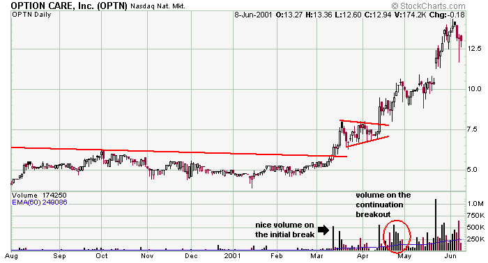
Here is an example of a stock that broke out from a very long basing period and then immediately traded into a bullish pennant. This scenario happens often. It takes a lot of energy to breakout of the base, so the stock needs to “rest” before continuing its move up. Notice the volume on both the breakout from the base as well as the breakout from the pennant.


Penn%20%28bull%29%20SNIC.png

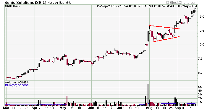
SNIC was a pretty simple play. The stock was in a steady uptrend when it exploded up in late-July. The stock then trended sideways in a small pennant and then busted out again with another volume surge. Textbook pattern and trade.


Penn%20%28bull%29%20FRNT.png

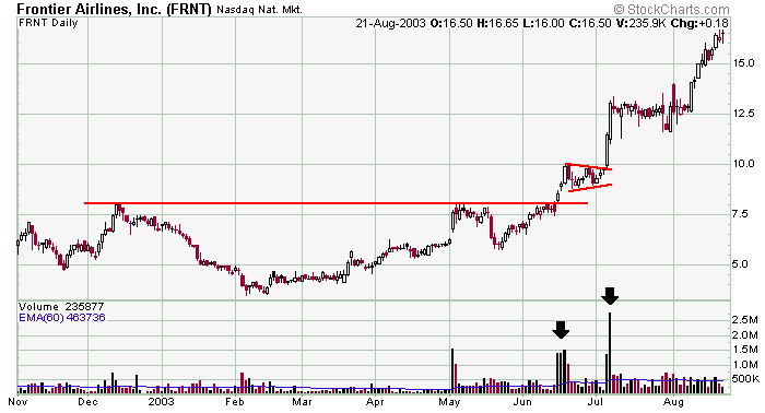
FRNT is another example of a stock that broke out of large base on strong volume and then immediately traded into a small bullish pennant. After its brief rest, the stock then broke out again on another strong volume surge. This action is typical and somewhat easy to play.
 
Bullish Flags

Bullish flags are small continuation patterns that represent brief pauses within an already existing uptrend. They appear flat or trade with a slight downward slant and typically occur in the middle of a large rally or immediately after a stock has broken out of a basing period.

flagbull_clip_image001_0000.gif


The slight short-term downtrend against the overall uptrend is very healthy as it functions to scare off weak and emotional long positions that would otherwise slow the movement after the breakout. These longs would sell at the first sign of strength. But instead, as the stock slowly trends down, these weak stockholders sell their positions. Once enough have sold, the overhead resistance in essence is cleared and the stock can continue its ride up.

Whether a bullish flag pattern appears during a large rally or after breaking out of a consolidation period, the expected price movement upon breakout is approximately equal to the preceding move into the flag.

It is important to emphasize that for a bullish flag to truly posses great potential, it must have been preceded by a significant move on heavy volume. Like pennants, bullish flags tend to be symmetrical in that the stock movement after the breakout often mirrors the move into the pattern.


Example :

Flag%20%28bull%29%20AZO.png

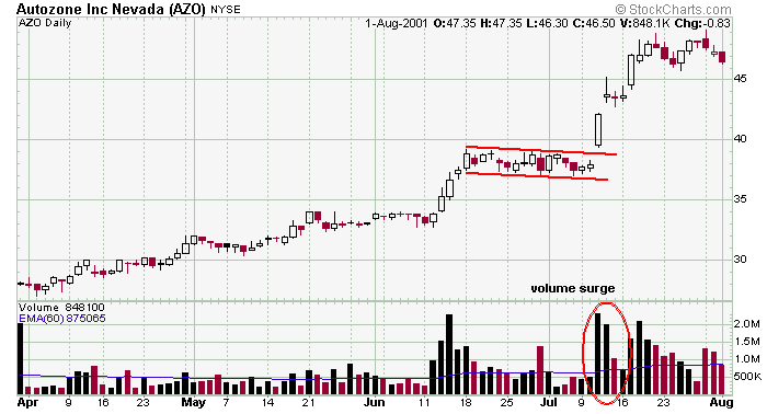
AZO formed a textbook bullish flag pattern in 2001. The stock was in a steady uptrend when it popped up on strong volume. It then traded into a 3+ week bullish flag on lighter volume before busting out on a huge volume surge. This is the exact sequence of events you want with a bullish flag pattern.


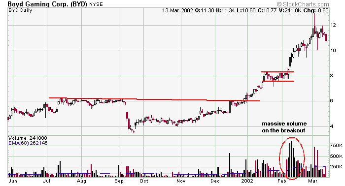
Flag%20%28bull%29%20BYD.png

BYD is an example of a stock that broke out of a large basing period and then needed to rest in a bullish flag before continuing its move up. In this situation you would use the move into the pattern to measure the expected move out of the pattern, but the massive volume that accompanied the breakout tells you there are a lot of buyers, and you can expect to get a bigger move.


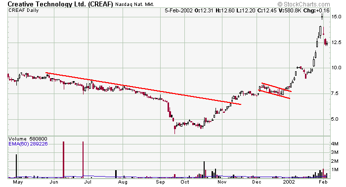
Flag%20%28bull%29%20CREAF.png

CREAF is another example of a stock that broke out of large basing period, moved up and traded into a bullish flag, and then busted out again. The move into the pattern (from approx. 4 to 8.5) predicted a move to 12.5 when the stock broke out at 8. Not bad, but price targets are only guidelines and should never be blindly adhered to. Sometimes stocks come up short while other times they blow right through them.


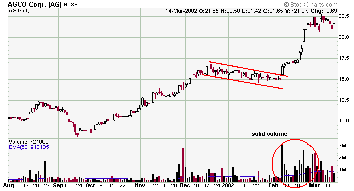
Flag%20%28bull%29%20AG.png

This is not what we would consider an easy trade. Certainly the chart posted here look easy and obvious to play, but notice how the stock basically giggled in place for a few weeks before busting out. It took a high volume gap up to break out of the pattern, and only an active and patient trader would have gotten in the trade.
 
Bullish Wedges

Bullish wedges are small continuation patterns that represent brief pauses within an already existing uptrend. They are characterized by converging trendlines and have a definite bullish bias. They are similar to bullish pennants except where pennants are generally flat, wedges have a definite slant against the overall trend.

wedgebull_clip_image001_0000.gif


Bullish wedges typically appear in the middle of a large rally or immediately after a stock has broken out of a basing period.

Bullish breakouts should be accompanied by a significant increase in volume with appropriate stops used if this is not seen.

The price action prior to a wedge formation can be used as a guide in predicting the price movement upon breakout. So, for a bullish wedge in an uptrend to truly possess great potential, it must have been preceded by a significant move (i.e. if the movement into the pattern was quick and full of energy, the rally after the breakout most likely will be quick and full of energy).

The expected price movement upon breakout is approximately equal to the distance of the move into the pattern.


Example :

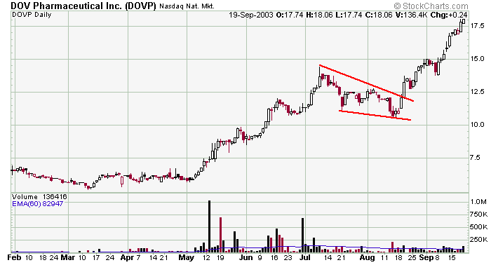
Wedge%20%28bull%29%20DOV.png

DOVP was in a steady uptrend when it traded into a downward sloping bullish wedge. This pattern is very similar to a bullish pennant except here both trendlines slant down. Volume popped on the breakout and was then fairly steady during the rally.


Wedge%20%28bull%29%20URBN.png

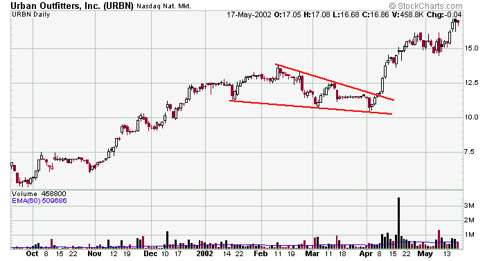
URBN traded into a textbook bullish wedge in the spring of '02. Three touches established both support and resistance and volume surged on the breakout. Pretty simple.


Wedge%20%28bull%29%20CRK.png

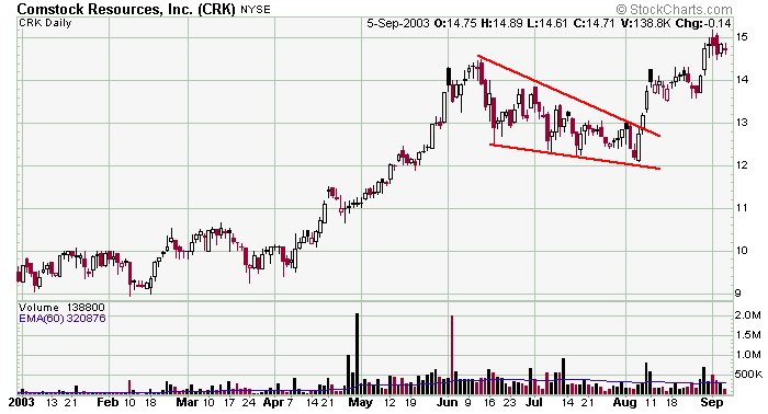
CRK was a herky jerky stock that traded into a downward sloping bullish wedge in the late summer months of 2003. Volume surged several consecutive days on the breakout, and that makes the pattern easier to trade because each of the highs from within the pattern can act as resistance on the way up. Getting a big explosive move that achieves “separation” from the breakout area is always desirable.
 
Bullish Head & Shoulder Bottom

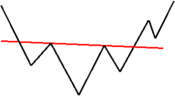
Bullish head & shoulders bottoms are powerful and reliable reversal patterns that appear as large basing periods after a substantial downtrend. Its completion signals a trend reversal. Three successive troughs characterize the pattern with the middle one being the deepest and the two outside ones being shallower and approximately equal.
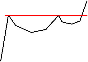
hsbull_clip_image001.gif

The above chart illustrates the sequence of events that unfold as the pattern develops. The left shoulder is formed as just another sell-off and bounce within a long downtrend. The stock then falls and makes another lower low. This action, which forms the left shoulder and first half of the head is no different than what is expected with a stock in a typical downtrend. And at this point in time, there is no way for the trader to know that a head & shoulders bottom is forming. The stock then begins its usual “bounce within a downtrend,” but not only does the stock trade above the left shoulder, it rallies to, or close to, the same level as the previous bounce. The head has now been formed. This is the first sign that the selling pressure may be abating and the stock seems to be gaining strength. A trendline, called the neckline, can be drawn between the two troughs. The stock then falls again but the imbalance of supply and demand is such that the stock does not make a lower low. This is the second sign the downtrend may be nearing an end. A rally from this shallower dip (right shoulder) through the neckline with a volume surge would mark a successful reversal of the downtrend.

Like all other upside breaks, a surge in volume must accompany the breakout. Failure to accomplish this doesn't necessarily mean the pattern will be a complete failure, but a red flag is raised. The stock may have broken prematurely due to overall market strength. The stock may just need to pull back to do more “work” (form a second right shoulder) before the real breakout occurs. Remember, a head & shoulders bottom occurs after a weak stock has been in a long downtrend. There really needs to be a massive amount of buying to reverse the downtrend.

The character and extent of the expected price movement upon breakage depends on several factors. Typically it is equal to the distance from the neckline to the extreme point of the head. But this is just a guideline. Head and shoulders is a reversal pattern, so there must be a significant move to reverse. A small move into the pattern usually results in a small rally upon break. Also, the rally tends to be the mirror image of the preceding drop. This means a quick and violent drop foreshadows a quick rally.

Duration of the entire pattern (i.e. how long the stock trades below the neckline) also plays a role. The longer the stock trades down there, the greater the chance that most of the disgruntled stockholders will have sold when a breakout happens. This means there will not be many investors who are looking to get out even; they have already gotten out.

Whether a stock pulls back to the neckline after breaking out can depend on the overall market. If the entire market is strong, there probably will be no pullback. If on the other hand the market is weak at the same time a stock completes its pattern, then a pullback is likely.


Example :

H&S%20bottom%20ANAD.png

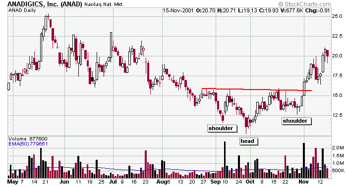
Head & shoulder bottom patterns rarely fit the textbook description, and ANAD is a good example of that. Typically you'd like the pattern to be bigger, but in this case the neckline was fairly easy to determine and the volume surge on the breakout sealed the deal. Absent the volume surge, the stock most likely would have pulled right back into the pattern.


H&S%20bottom%20MACR.png

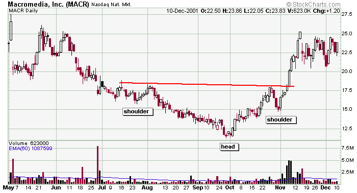
MACR formed a nice head & shoulder bottom pattern in the fall of 2001. Notice the volume pick up on the right side of the head, and fall off on the left side of the right shoulder. The volume surged when the stock exploded out of the pattern.


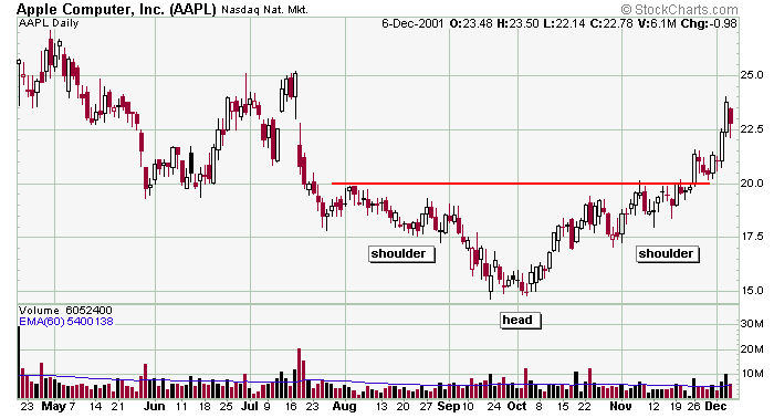
H&S%20bottom%20AAPL.png

Whole numbers are often significant numbers, so when AAPL formed a head & shoulder bottom pattern with its neckline at 20, the astute trader needs to pay more attention. The move down into the pattern was 5 points (from 25 down to 20) and the size of the head was 5 points (15 to 20), so the projected move out of the pattern was 5 points (from 20 to 25). We didn't quite get it (probably because there wasn't much volume on the breakout), but we did get a nice 20% move nevertheless.
 
Bullish Cup & Handle

Cup & handle patterns are powerful and reliable continuation patterns that form in uptrends and therefore have bullish implications. Their completion signals the end of a consolidation period and the continuation of its bullish uptrend.

chbull_clip_image001.gif


The above chart illustrates the sequence of events that unfold as the pattern develops. After a nice rally (preferably on solid volume), the stock begins a long drawn out correction. When the pullback begins, many stockholders decide that after the nice rally, they now would like to take profits up near the peak. There were also many late-to-the-party buyers who bought at the peak, and as the stock starts to drop, these stockholders have one thing on their mind – to “get out even.” These two groups will create selling pressure when the stock regains strength. Months later when the stock trades close to the first peak, stockholders jump at the opportunity and start selling. Thus a second pullback begins. A line drawn through the two peaks forms a trendline. This second pullback is very healthy and normal for a strong stock or a stock that is gaining strength. Since stock movements have such a large psychological component to them, it is unlikely the stock will enjoy any type of rally as long as there exists many disgruntled stockholders. It takes time to weed out these weak links. Once enough time has passed (the formation of the handle), the stock is free to move higher for there is now an absence of stockholders who will sell at the first good opportunity.

The trendline should be flat or slightly downward sloping. Cup & handle patterns usually take several months and sometimes over a year to form.

The best patterns possess a decent amount of symmetry with the right half of the cup mirroring the left half and the right half of the handle mirroring the left half. But while it is nice for the pattern to have a smooth even balance, it is not absolutely necessary. Also, it is important that the handle not go below the midpoint of the cup. Theoretically, only the selling to satisfy the people who want to get out near the previous high needs to take place. But if the stock drops below the midpoint of the cup, it is a warning that more selling is taking place than simply a handful of panicky holders.

It is not unlikely, and perhaps common, for 2 handles to form, so anticipating the breakout and entering a position early is not a good idea. This is healthy for the stock and is simply an indication that a little more “work” is needed to allow the weak stockholders to get out.

The same breakout requirements govern as with other breakouts. Volume must surge to validate the breakout, and appropriate stops shall be implemented if volume is not satisfactory.

There are two guidelines a trader can use to determine the expected price movement upon breakout. The first is the equal to the depth of the cup. The second is the price movement into the first peak. Often the strength or weakness of the overall market will dictate the success of the pattern.


Example :

C&H%20GSIC.png

GSIC rallied strongly from penny stock land and then formed a nice cup & handle pattern with easily defined resistance. Notice the volume starting to pick up on the right side of the cup and then drop off on the left side of the handle before surging during the breakout. That is textbook action.


C&H%20HEPH.png

HEPH also formed a cup & handle pattern while in a steady uptrend. The stock did pull back to test the breakout area, and after succeeding it began a nice steady climb. It would have been nice to get a big breakout from the get-go, but this isn't rocket science – patterns don't always work perfectly. As long as the stock stays in its uptrend, there is no reason to exit the trade.


C&H%20WMAR.png

WMAR is another decent cup & handle example. Notice the volume starting to pick up on the right side of the head and then falloff on the left side of the handle. That is the type of action you want to see.
 
Bullish Trendlines

We classify trendlines as being either continuation patterns or reversal patterns.

Small trendlines that form after a nice advance are continuation patterns that definitely have a bullish bias. Although the stock doesn't exactly fit the bullish flag, pennant, or wedge patterns, it still remains a strong stock in an uptrend that is temporarily “resting” before continuing its upward movement. These trendlines shall be played the same as the continuation patterns previously discussed. This is to say a volume surge is needed to confirm the breakout and the pricing action after the breakout should mirror the move into the pattern.

Bullish trendlines also appear after a stock has suffered a big drop and is forming a base. The pattern must be long and drawn out. This requirement allows time for mad stockholders to sell their positions and be replaced by new stockholders who aren't so upset and won't sell at the first sign of strength. Like the head & shoulders bottom reversal pattern, there really needs to be a massive amount of buying to be considered valid. Remember, an attempt is being made to reverse a large downtrend, and that takes great effort.


Example :

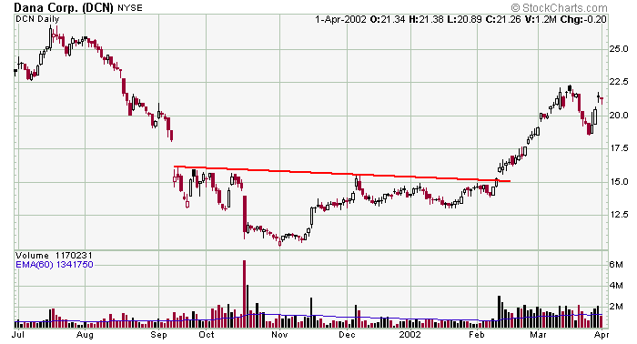
TL%20%28bull%29%20DCN.png

After gapping down and basing for 5 months with easily defined resistance, DCN broke out on steady volume that lasted well over a month. Maybe you can call it a head & shoulder pattern with two shoulders on each side…it doesn't matter. The only important features are the size of the base (5 months) and the volume on the breakout. We got both, so it doesn't matter what you call the pattern.


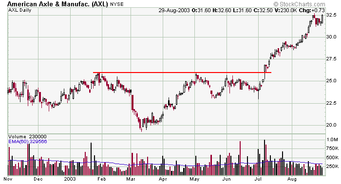
TL%20%28bull%29%20AXL.png

AXL was generally trading neutral with easily defined trendline resistance overhead. Until the stock breaks out on volume, there isn't much to do from a “chart pattern” standpoint other than play the range. But once resistance is taken out on big volume, the stock become playable to the upside.


TL%20%28bull%29%20CNX.png

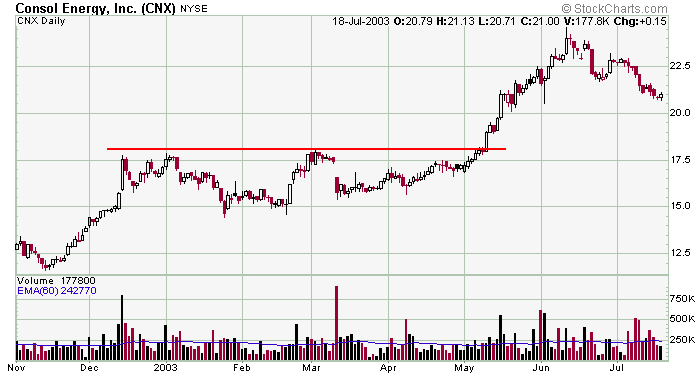
CNX is another simple example of a trendline being used to determine entry on a trade. Resistance is formed by a couple touches, and volume pops on the breakout. Notice how the pricing action on the rally after the breakout is very similar to the pricing action on the move up into the pattern.


TL%20%28bull%29%20IMAX.png

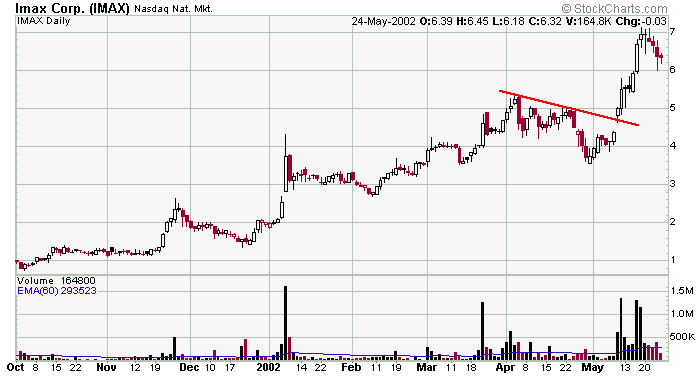
IMAX didn't really fit well into the bullish wedge, flag or pennant patterns, but the pattern was too good to ignore. In this case we just plop it into our bullish trendline category and play the volume breakout like any other continuation pattern.
 
Neutral Symmetrical Triangles

Neutral symmetrical triangles represent neutral periods of doubt and indecision. They are characterized by a series of higher lows and lower highs as the forces of supply and demand are nearly equal. Each rally is seen as a selling opportunity while each dip is met with buying. The pattern is typically large and takes several months or more than a year to form.

stneut_clip_image001_0002.gif


The best breakouts occur ? to ? of the way through the pattern. A stock seems to gain energy as it is compressed into the triangle, but that energy dissipates beyond the ? point. It is recommended that traders abandon a stock that trades beyond the ? mark for very little movement is likely to occur. Volume typically diminishes as the pattern develops because traders become more and more unsure as to the stock's future direction. Then, seemingly without warning, the stock explodes out of the pattern.

Symmetrical triangles can form in trends, but their sheer size will often neutralize whatever momentum existed when the pattern first started to form. So when an extremely large pattern forms one can never be sure which way it will break until it actually happens. Rarely are any reliable clues given. A trader can only wait until the stock “makes up its mind;” then and only then should money be committed to a position.

Breakouts to the upside follow the same guidelines as bullish symmetrical triangles and breakouts to the downside follow the same guidelines as bearish symmetrical triangles.

The expected price movement upon breakout is approximately equal to the widest part of the pattern.


Example :

ST%20%28neut%29%20TWR.png

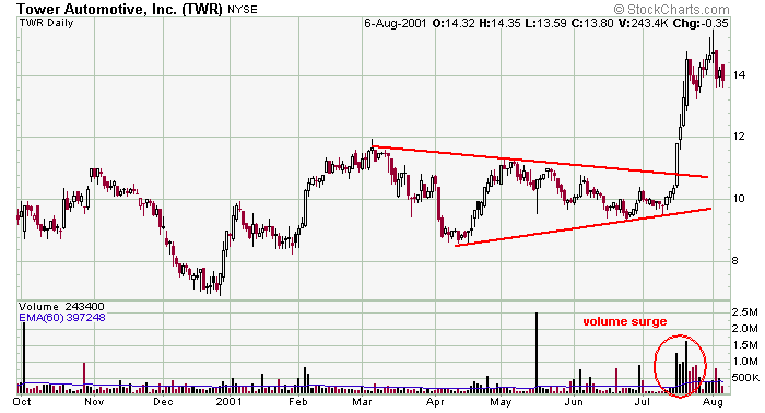
TWR was generally a neutral stock. Although it was in a slight uptrend, the size of the symmetrical triangle neutralizes whatever momentum existed on the rally into the pattern. In this case the stock could breakout either way. Although there were a few black volume surges within the pattern, the volume is neutreal, so as a trader you really have to wait until the stock makes its move. Obviously you can see the result...with volume to support the move.


ST%20%28neut%29%20WMS.png

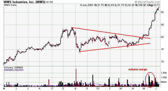
WMS was in a steady uptrend when it traded into this large 6-month symmetrical triangle. The size of the pattern neutralizes the strong move into the pattern, so the stock simply becomes trendless rather than a strong stock in a steady uptrend. The size of the pattern was about 10 points, so that is our first expected price move. Once that is accomplised, use the rally into the pattern to project the second target.


ST%20%28neut%29%20CTXS.png

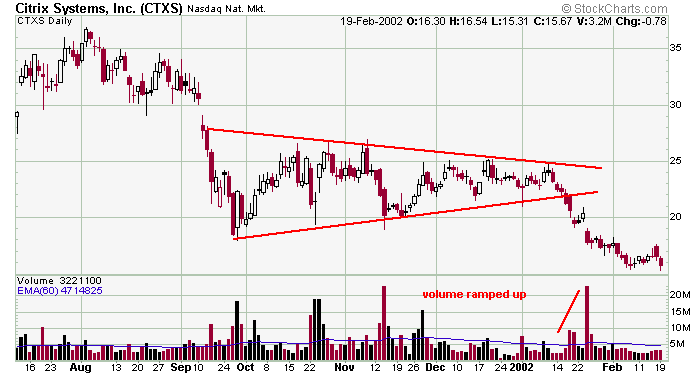
CTXS was in a downtrend when it traded into this symmetrical triangle. If the pattern lasts a couple months we would consider the stock to be weak and is a downtrend (and most likely to resolve itself to the downside), but the pattern is big enough to neutralize the battle between the bulls and bears. The stock did continue the move down, but it could have broke out either way.


ST%20%28neut%29%20DISH.png

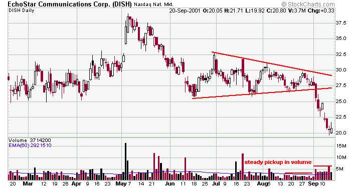
DISH was trending sideways for 6 months when it made a series of higher lows and lower highs to form this symmetrical triangle. Given the neutrality of the pattern, the stock could have broken out either way. Notice how volume fell off towards the end of the pattern and then ramped up after the break. That's exactly what you want to see.
 
keren banget pembahasaanya. akan tetapi harus menyiapkan google translate dulu sebelum membacanya hehehe..,,
penjelasanya menggunakan bahasa inggris >:'(

lanjutkan brader...,, =b= =b=
 
keren banget pembahasaanya. akan tetapi harus menyiapkan google translate dulu sebelum membacanya hehehe..,,
penjelasanya menggunakan bahasa inggris >:'(

lanjutkan brader...,, =b= =b=

huauahahahha...bahasa inggris kite sama2 blepetan..mesti nyimak bener2 nih biar ga miss..hahaha:mad:)
 
huauahahahha...bahasa inggris kite sama2 blepetan..mesti nyimak bener2 nih biar ga miss..hahaha:mad:)

Kalau kesulitan bahasa Inggris pakai translate mbah google saja gan, saya kira akan sangat membantu untuk memahami apa yang disampaikan di sini. Salam sukses. :)
 
Silahkan dilanjut gan andelumut, kita setia menyimak pelajaran yang agan sampaikan..hehe. Dan bagus juga bisa disampaikan materi praktek di sini, nanti kawan-kawan tinggal menambah.
 
Okay, berhubung sepi maka saya ramaikan thread ini. Nanti kalau sudah kembali bro andelumut biar dilanjutkan. Mengenai materi dasar trading forex adalah tentang candlestick. Candle yang sering dipakai adalah doji, hammer, long lower shadow, dan beberapa formasi yang lain. Candlestick sepanjang pengalaman dan pengamatan saya, cocok diaplikasikan dengan time frame D1, H4 dan H1. Kalau lebih kecil dari itu sering terjadi false signal.
 
Untuk lebih mempertajam analisa menggunakan candlestick, kita bisa menambahkan 2 indikator saja yaitu Simple Moving Average dan Bollinger Bands. Nah, setting disesuaikan dengan style agan-agan, dan lakukan pengamatan dalam waktu yang cukup. Momen cross antara candle dan SMA merupakan saat-saat baik untuk entry atau pun exit. Maka dalam hal ini harus dilakukan pengamatan dalam waktu yang panjang/cukup.
 
Untuk analisa fundamental, kita harus memahami secara pelan-pelan mulai dari indikator perekonomian yang berpengaruh pada fundamental ini. Pendapatan penduduk, pengeluaran penduduk suatu negara, diantaranya yang perlu kita ketahui. Selain itu kondisi politik, keamanan, bencana yang sifatnya temporer, bisa menggerakkan market forex juga. Bacalah buku-buku mengenai fundamental atau ebook yang menjelaskan, agar lebih meningkat pengetahuan kita.
 
Back
Top